WEBSITES

OBJECTIVE
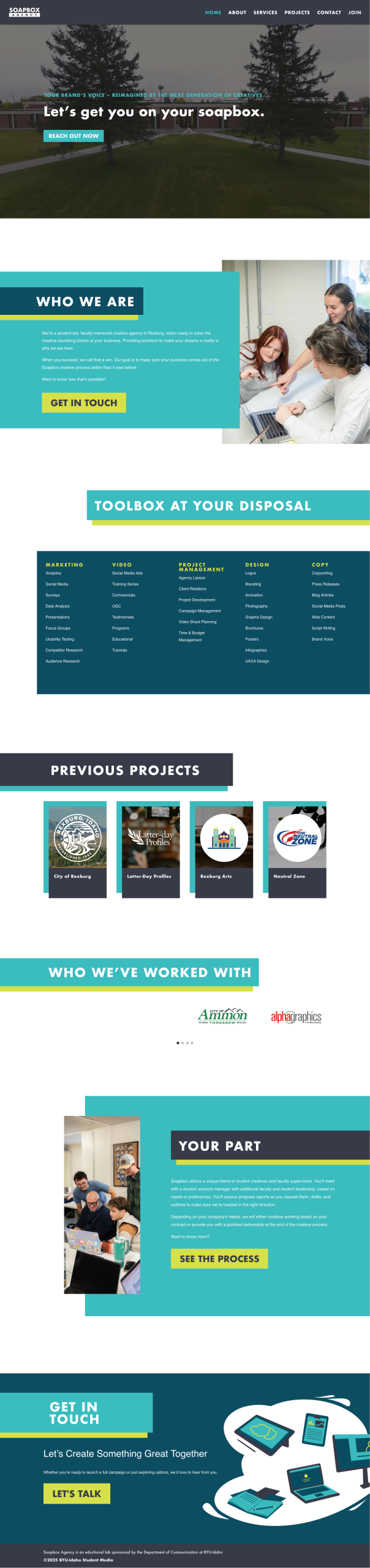
During my time working at Soapbox Agency, I was tasked with designing the agency website rebrand over the summer of 2025.
EXECUTION
I led the design process from wireframes to refined mockups in Figma. Custom icons and graphics were created in Illustrator.
RATIONALE
When designing a website for a company or agency, the first instinct is to prioritize a “safe” professional look that can risk becoming boring. However, to truly represent Soapbox and differentiate them within the industry, I wanted to choose a more unique visual direction.
I intergrated overlapping elements to add character and movement to the design, which prevented it from feeling flat. By pairing these dynamic elements with bold accent colors and high contrast titles, I was able to maintain a structured, formal base.
The hard edges, clean fonts, and uncluttered layouts provide visual balance, giving the viewer’s eyes a rest, and ensuring that it feels both professional and modern.

DESIGN CONTRIBUTION
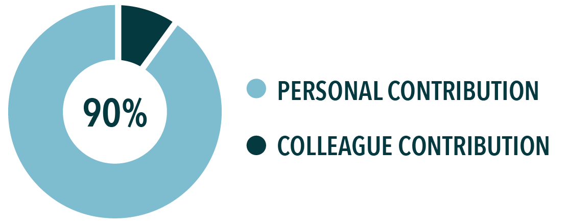
I designed responsive layouts for both mobile and desktop across the pages listed above.
Four project case study pages were included in the original rebrand launch, which I also designed.
WORDPRESS EXECUTION CONTRIBUTION
The execution transitioned to my colleague at the beginning of the BYUI Fall Semester for final adjustments and optimization.
Part of these final touches included SEO adjustments.
INTERACTIVE MOCKUP
WIREFRAMING PROTOTYPING SEO OPTIMIZATION CMS MANAGEMENT RESPONSIVE DESIGN
SEO OPTIMIZATION RESPONSIVE DESIGN

OBJECTIVE
I collaborated with one of the designers on my team at Soapbox Agency to design a website for Wingman Dating Services. I also helped in the ideation of the logo we also designed.
EXECUTION
The other designer had not had very much experience with designing websites. I assisted her in understanding the basics of the process, and then we designed separate first drafts of the home page.
RATIONALE
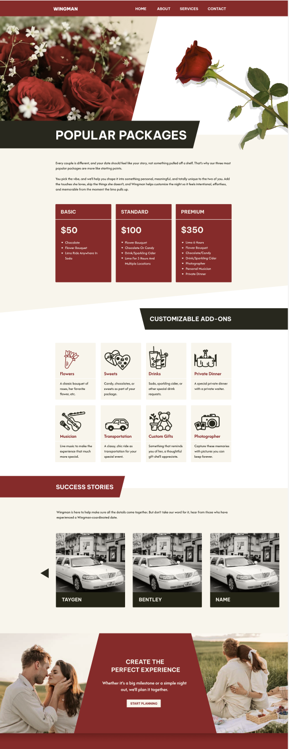
The design strategy for Wingman focused on a target audience of men in committed relationships seeking a little help to make special occasions and their partner feel special. We selected a deep red to symbolize love, while grounding the palette with tan, white, and dark grey to avoid the overly feminine styles typical of the dating industry.
Our research into sites frequented by our target audience revealed a preference for minimalistic layouts and white backgrounds. To maintain visual interest while ensuring a clean user experience, we integrated a low-contrast tan to provide subtle section breaks without disrupting content flow.
For this client, I assisted in the ideation of an original logo. The final logo includes a minimalistic rose icon and wordmark, while still including sharp, geometric angles to retain a masculine feel. We carried these angles throughout the website’s UI to create a cohesive visual language with a structured, masculine edge.
INTERACTIVE MOCKUP
DESIGN CONTRIBUTION
We utilized an iterative design process. Through multiple rounds of client feedback, we were able to combine our first drafts into a final refined Home page. I personally designed both the Services and Contact page, ensuring a cohesive user journey.
Another colleague was tasked with the website execution based on the final designs.
Let's Create Designs that Drive Results and Elevate Your Brand
Searching for a designer who can help elevate your team? I believe the best designs come from strong collaboration and a proactive mindset. I'm ready to contribute my skills and help your creative team thrive.
Let's connect to discuss how my expertise and experience can advance your objectives.