
ILLUSTRATION

OBJECTIVE
A big part of my life growing up was playing card games. Whether that was with my siblings, family, friends, or at events, it was something that brought everyone together.
This project was passion-driven and explores the intersection of history and functional game design.
EXECUTION
Most of my process for this project was in the planning stage. This included deep-diving into research, brainstorming regional elements, and making key design decisions. I prioritized historical accuracy to ensure the deck felt authentic to the U.S. in the 1700-1800s. Once I had refined my ideas through sketching, I translated them into high-quality vector assets using Adobe Illustrator.
FOURS
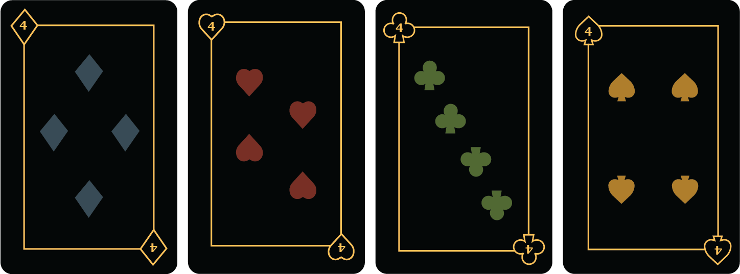
Most classic decks use identical layouts for every numbered card. No variations, nothing unique, and I guess you could say, “if it isn’t broke don’t fix it.” However, I didn’t want to settle for what everyone else had done; I wanted to challenge the norms.
To achieve this, I developed a distinct layout for each of the fours. This exploration of unconventional grids also led to my innovation of the classic seven card.
SEVENS
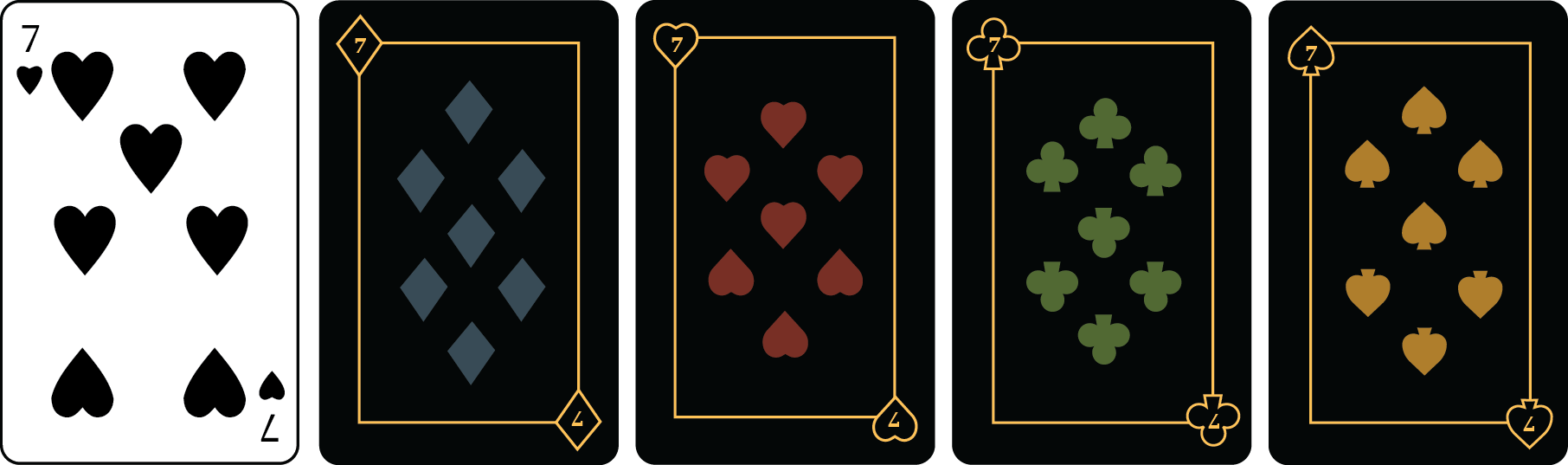
My lucky number is seven. That might seem like a minor detail, but as you look at a seven from a classic deck, shown below, you may notice how it lacks symmetry and visual balance.
Now, I could have overlooked this and focused entirely on the face cards, but I couldn’t ignore it, especially not for my lucky number. After sketching various configurations, I finally developed something that I could be proud of, which is shown below.
It successfully resolves the tension found in the original, resulting in a design that is more aesthetically pleasing and balanced.
RATIONALE
Growing up my family traveled a lot around the United States visiting historical sites, which inspired the theme of this deck. To ensure the deck remained highly functional, I established four visual identities based on the North, South, East, and West regions of the U.S.
While my early concepts favored high-detailed complexity, I pivoted to a cleaner and simpler style to prioritize instant recognizability during game play.
Implementing high-contrast main color systems for each suit enhanced the deck’s instant recognizability and visual accessibility. I also researched common associations before assigning the main colors to each suit. For example, red is associated with love, so I connected it with the heart suit, and clovers are green, so I used that palette for that suit.
JOKERS
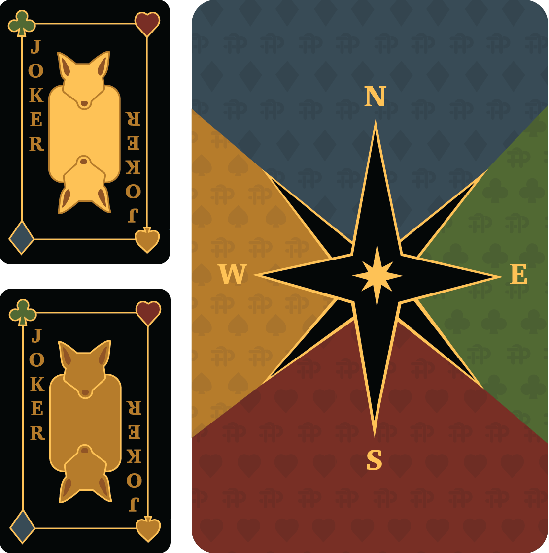
Originally, I had planned to use Bald Eagles as the Jokers, given their status as the primary symbol of the United States. However, I felt it was important not to associate such an esteemed national icon with Jokers, who are often seen as tricksters and comedy figures.
Returning to the ideation phase, I researched animals traditionally associated with trickery and wildness. I eventually settled on a fox, as its clever and unpredictable nature perfectly captures the spirit of the Joker.
DECK BACK
The back of the deck was inspired by a compass, which includes all four directions which correlate with the regions represented in the deck. The corresponding primary color and symbol from each suit makes up the section corresponding with the direction.
DIAMOND
The northern states are known for their cold weather and fur clothing. I based their outfits on the fur collars on the coats which were typical of that time period.
I chose to do the divider as branches from a fir tree as its evergreen nature makes it a classic and recognizable symbol. For the Ace, I selected a bear as the primary icon, based on my research of the regional wildlife. There are many other iconic animals in the Northern regions of the U.S., however, it was imperative that I choose four animals that could align with the style and also visually match each other.
HEARTS
Growing up in Texas made the Heart suit deeply personal to me. I drew inspiration from farmers and a “Southern Belle” for the face cards. The divider is inspired by the barbed wire fences surrounding my family’s cattle fields, and the beautiful longhorn I had as a child inspired my Ace.
Choosing which suit to represent the South was easy because of this personal connection. To me, the Heart embodies the warmth and love shown through “southern hospitality.”
CLOVER
My primary goal was to represent the diverse identities of early U.S. history. After establishing the North and South inspired suits, I turned to the East to highlight another essential piece of American history.
The fur trappers of the Appalachians were influential in adapting to a new landscape, and they became my main inspiration for the Clover suit. The divider represented the leaves and vines of the Appalachian forests, and the green as the primary color for the Clover suit to reinforce these connections. The Ace features a horse, representing its vital role in navigating the treacherous mountain terrain.
SPADE
To complete the deck, the Spade suit honors the Native Americans of the Great Plains and American West. Based on my research into those time periods, the West represented a pivotal era of environmental shift for these Indigenous people.
The Ace features the Buffalo, which was a central figure in their culture and resources. By highlighting the Buffalo, I wanted to acknowledge the profound impact that its near-extinction, caused by the settlers, had on the tribes.
Let's Create Designs that Drive Results and Elevate Your Brand
Searching for a designer who can help elevate your team? I believe the best designs come from strong collaboration and a proactive mindset. I'm ready to contribute my skills and help your creative team thrive.
Let's connect to discuss how my expertise and experience can advance your objectives.